Back to all work
Real Estate, Brand Identity
Dura Haven
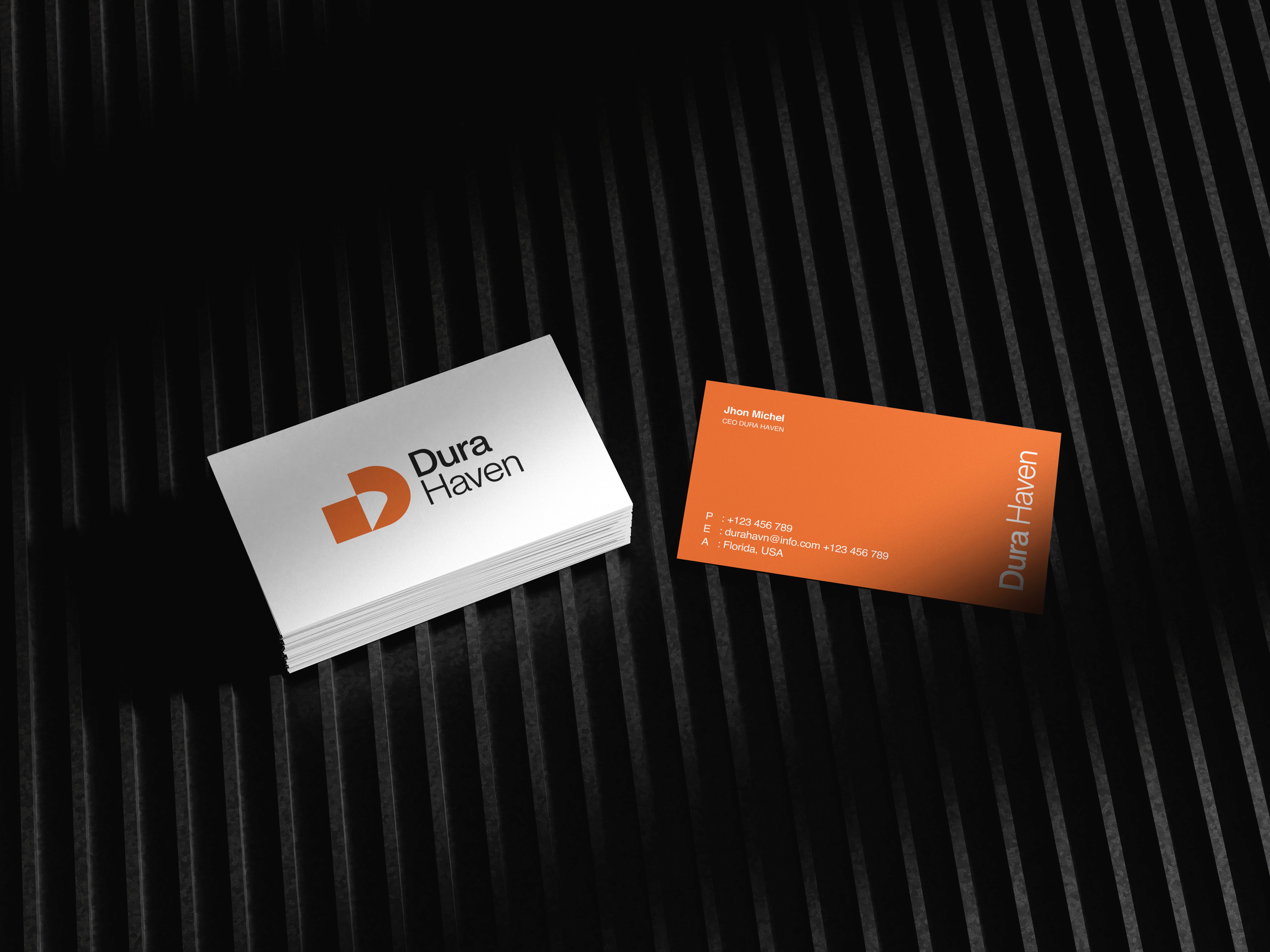
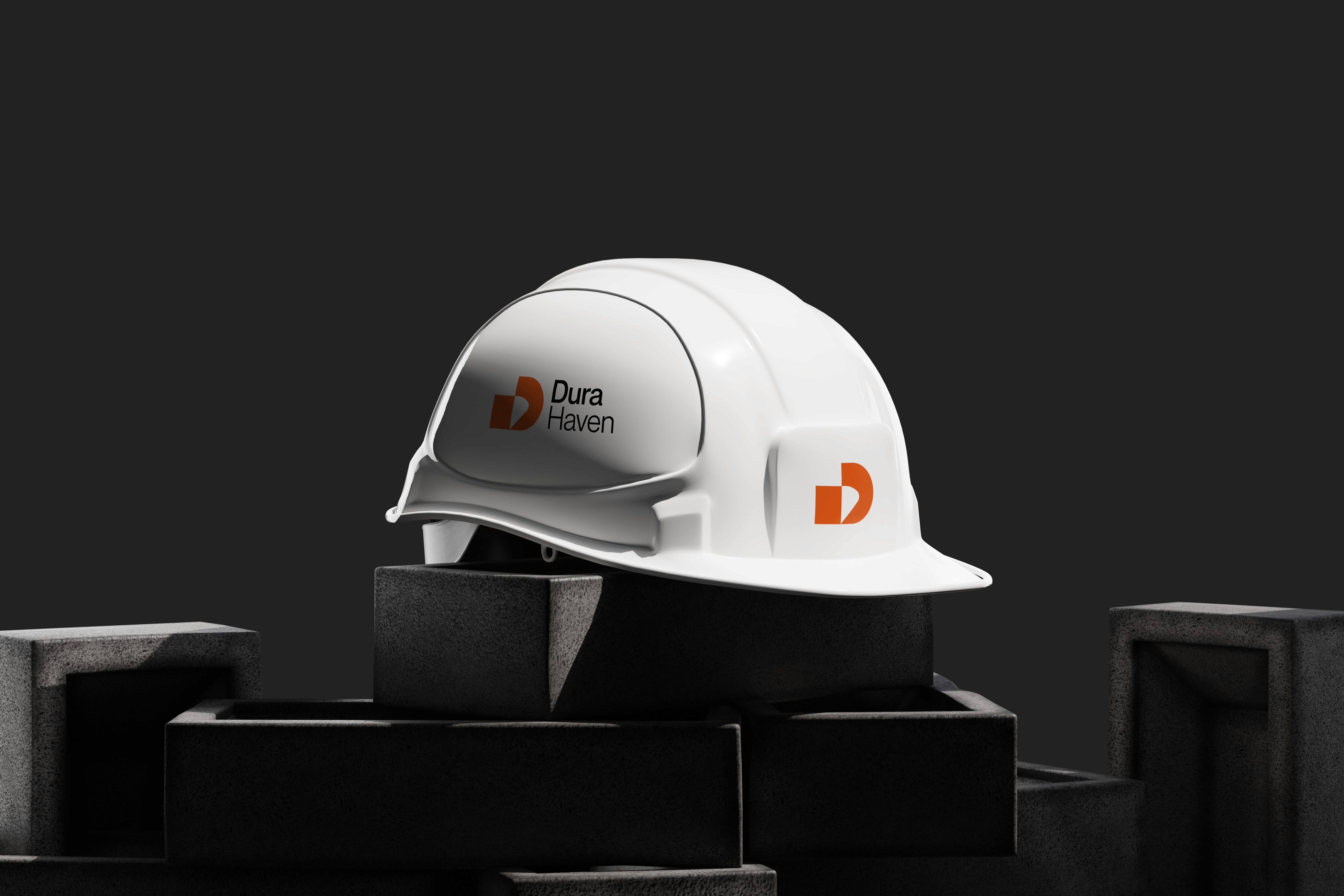
Dura Haven is a real estate brand built on trust, durability, and refined living. This project showcases a complete brand identity system designed to position Dura Haven as a distinctive name in the property market.
Client
Dura Group
Year
2025
Discipline
Real Estate, Brand Identity
Deliverables
Packaging · Illustration · Full Brand Identity

The brief: build a brand that feels like home
Our goal? Establish Dura Haven as a symbol of enduring quality in real estate. The brief was to create a brand identity that feels both solid and welcoming—one that communicates permanence while inviting people in. We needed to build a visual and verbal identity that resonated with discerning buyers, investors, and families alike, standing apart in a competitive property market.
The problem
The real estate industry is crowded with generic branding—stock imagery of keys, roofs, and handshakes.
The process
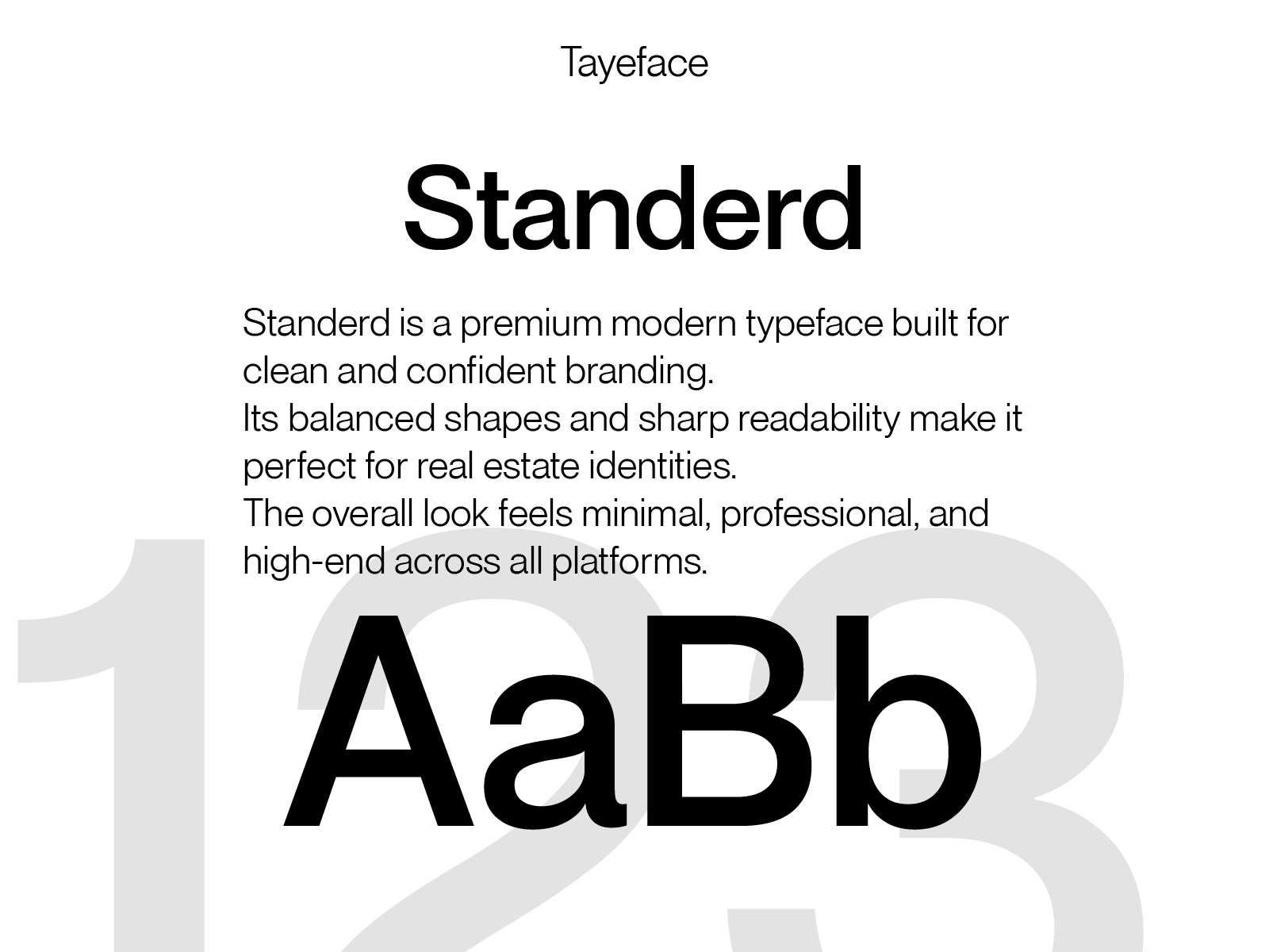
We began by distilling the brand to its essence: strength and sanctuary. Every design decision, from the logotype and typography to the color palette and architectural imagery, was made with care and intention.
We drew inspiration from natural materials, warm earth tones, and the quiet beauty of well-crafted spaces.
The result
The result
The Dura Haven identity delivered a cohesive brand experience that resonated deeply with its target audience. The brand didn't just launch—it established itself as a trusted name.
Achieved a 190% increase in brand recognition across key real estate demographics.
Generated over 2 million impressions in the first quarter.
Secured partnerships with 20+ premium property developers and agencies.
Drove a 65% increase in qualified leads within three months.